Evolving a legacy nav on user evidence when marketing wanted sales language in the product.
Company
Artera, patient communication for health systems
Role
Sr. Director of Product Design (Head of Design)
Timeline
Oct 2023 – Jul 2024+
The problem
Customers couldn’t find the capabilities they were sold.
The nav was at capacity
Earlier promotions had moved Campaigns and Automations out of Settings onto the primary nav. Right direction, no room to scale, and Insights lived behind a separate login.
The org model aged out
The product was built for one clinic at a time. Healthcare moved to centralized call centers, which meant staff were constantly flipping practices to see messages, and activity was easy to miss.
Marketing terms didn’t guide
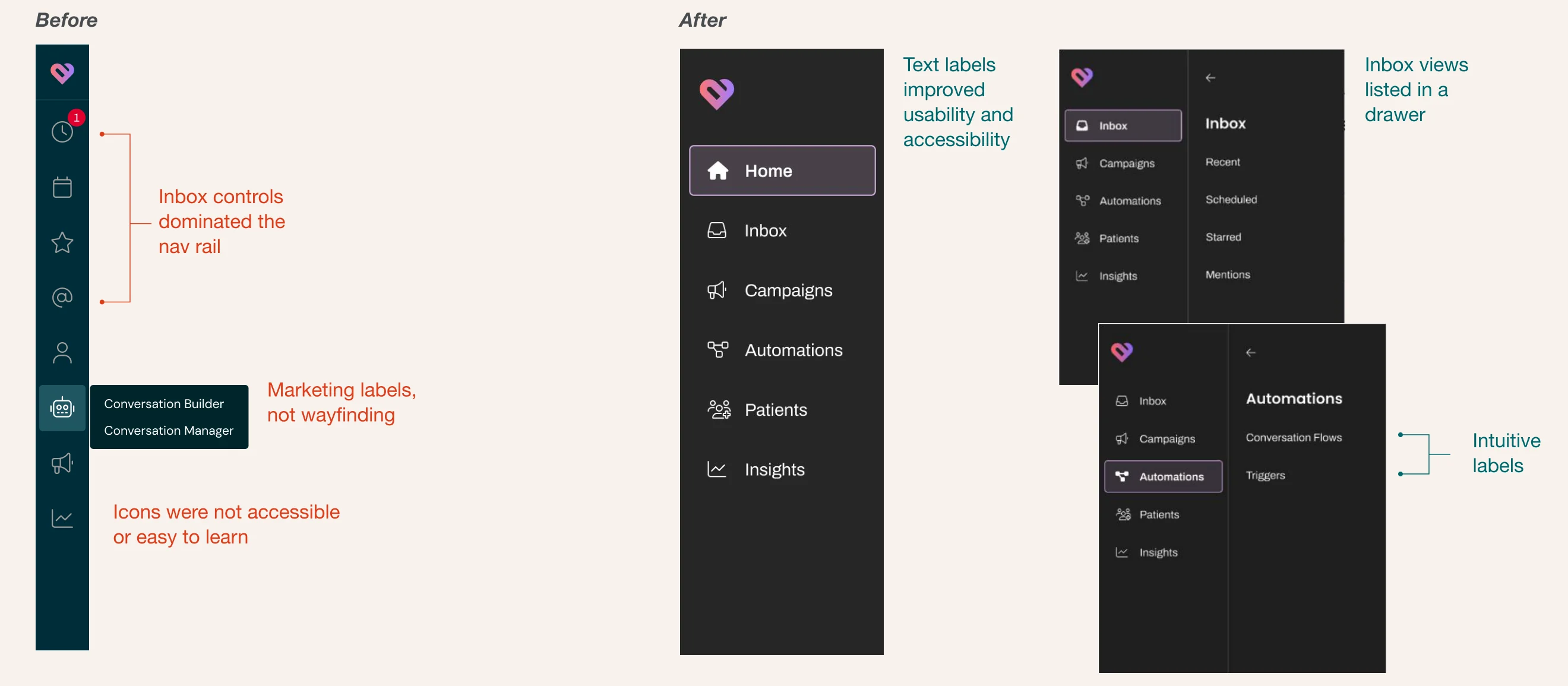
Branded terms, Conversation Builder and Conversation Manager, were too long for a nav, and icon-only meant we wouldn’t meet a future accessibility bar. We were in a standoff with PMM.
Role & scope
What I owned
Stakeholder management
Drove decision rounds with Product Marketing, Sales and CX, and owned the downstream-impact framing for the ELT.
Research
Moderated and unmoderated user testing (tree tests, preference tests, task-based usability, first-click) and collaborative workshops.
Design
Information architecture and the primary nav system, scaffolding for future surfaces (including Enterprise Inbox), and low- and high-fidelity design.
I partnered with
ELT on decision and FYI (not a stealth redesign)
VP of PMM, the hardest stakeholder: sales language versus usable labels
Product Marketing, Sales, and CX on announcement, education, and collateral
Engineering on phase-1 routes and page paths
The design team (7) on workshops, tests, and ship readiness
Approach
Evidence over opinion. User testing beat internal bias and marketing language.
Oct–Nov 2023Ideate
Team-wide sessions proposing a scalable IA to win with Harmony.
Dec 2023Test
Tree testing and preference testing for IA organization and brand treatment.
Jan 2024Design
Two research cohorts to lock main nav and sub nav labels and the interaction pattern.
Mar 2024Recommend
Release plan and downstream impacts; customer comms and engineering routes.
Jul 2024Ship
Released to all accounts; shared via webinar, email, and an in-product walkthrough.
Jul 2024+Listen
Collected and responded to customer feedback; planned iterations with the roadmap.
Deep dive: design
From icon folklore to intuitive wayfinding.
Deep dive: research
Evidence that unlocked the labels and the design.
n=590
Total testers
Across tree testing and preference testing. Other data was mined from NPS, previous usability tests, and customer success.
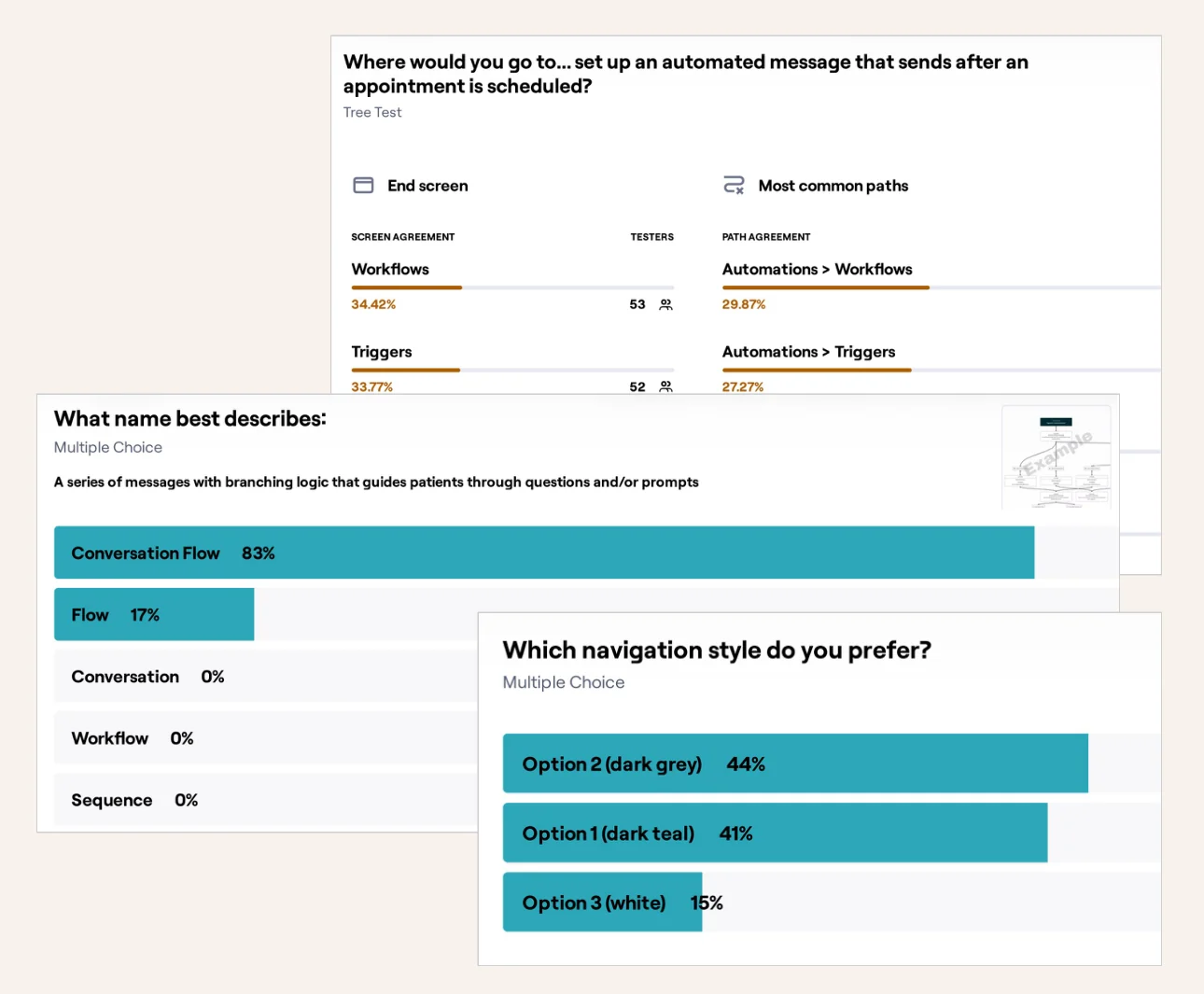
83%
Chose “Conversation Flow”
As the name for branching message logic. Flow got 17%; Conversation, Workflow, and Sequence got 0%.
~34%
Tied on scheduled messages
The scheduled-message task split almost evenly between Workflows and Triggers. Neither result was strong enough to decide, so we used product judgment and shipped Triggers.
85%
Preferred a dark nav
44% dark grey, 41% dark teal. Only 15% chose white.
Results from the tree test, naming test, and navigation-style preference test.
Outcomes & impact
Discoverability and accessibility moved. The lasting win was who owns the words.
Discoverability, on purpose
Labels surfaced capabilities that icons had hidden. Campaigns is the proof: staff who never recognized the icon started asking what it was. That was the goal, not a support failure.
A path to 508
Text labels plus contrast that met accessibility guidelines in the primary nav. Not full compliance, but the first real step toward a future government contract.
Cross-functional alignment
Marketing owns buyer-facing language. Design owns in-product labels. That split was the outcome, so the next rename wouldn’t restart the conflict.
This phase was a stepping stone. The Inbox drawer was temporary. Enterprise Inbox would make Inbox a destination with its own nav, which is why the extra click to Mentions was acceptable to hold, not a reason to undo the system.
Feedback & next steps
We listened and responded, but didn’t roll back the changes.
Feedback
“I want to escalate the need to get the mentions added back to left hand column to make it easier to see when there is something being called. There was a change that moved it to an additional click.”Enterprise health system customer
Response
Already on the roadmap. Enterprise Inbox would make Inbox a destination, so Mentions sat with the other inbox views instead of behind a second click.
Feedback
Users expected the open main nav item to stay highlighted. Other users expected a second click on a given item to close the drawer. Valid feedback on interaction patterns.Shared via customer success team members
Response
Logged, not rolled back. Highlighting the open item and closing the drawer on a second click shipped as polish, after the IA was held.
Also read: Verifiable trust, made visible
How research changed what we built to give enterprise buyers proof they could act on.